In today's mobile-first world, having a responsive website isn't just a nice-to-have—it's essential for business success. A responsive website adapts seamlessly to different screen sizes, providing an optimal viewing experience across all devices. But responsive design goes beyond just looking good—it's about creating websites that convert visitors into customers.
1. Understanding Responsive Design
Responsive web design is an approach that makes web pages render well on a variety of devices and window or screen sizes. It uses flexible layouts, flexible images, and cascading style sheet media queries to achieve this adaptability.
Key Principles of Responsive Design:
- Fluid Grids: Layouts that scale proportionally with screen size
- Flexible Images: Images that scale with their containers
- Media Queries: CSS rules that apply based on device characteristics
- Mobile-First Approach: Designing for mobile devices first, then enhancing for larger screens
2. Mobile-First Design Strategy
Starting with mobile design first ensures that your website works perfectly on the most constrained devices, then progressively enhances for larger screens.
Mobile-First Best Practices:
- Prioritize essential content and features for mobile users
- Use larger touch targets (minimum 44px)
- Simplify navigation and reduce menu items
- Optimize images for faster loading on mobile networks
- Test on actual devices, not just simulators
3. Optimizing for Conversions
Responsive design isn't just about aesthetics—it's about creating websites that drive action and convert visitors into customers.
Conversion Optimization Strategies:
- Clear Call-to-Actions: Make buttons prominent and action-oriented
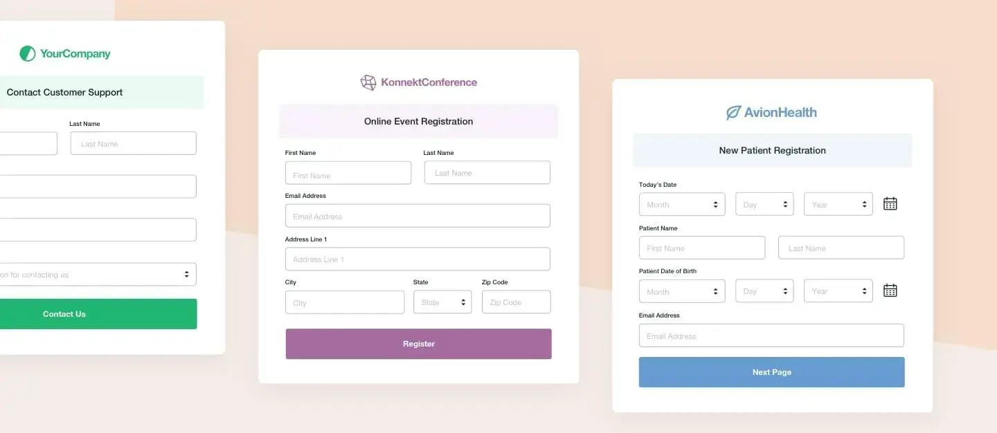
- Simplified Forms: Reduce form fields and use mobile-friendly inputs
- Trust Signals: Display testimonials, certifications, and security badges prominently
- Fast Loading: Optimize images and minimize HTTP requests
- Social Proof: Show customer reviews and ratings
4. Technical Implementation
Implementing responsive design requires careful attention to technical details and best practices.
Responsive Breakpoints
5. Performance Optimization
Fast-loading websites are crucial for both user experience and search engine rankings.
Performance Best Practices:
- Image Optimization: Use webp format and responsive images with srcset
- Minification: Compress CSS, JavaScript, and HTML files
- Lazy Loading: Load images and content as users scroll
- CDN Usage: Distribute content globally for faster delivery
- Critical CSS: Prioritize above-the-fold styling
6. User Experience Enhancements
Beyond technical implementation, focus on creating delightful user experiences that encourage engagement and conversion.
UX Enhancement Tips:
- ✅ Intuitive navigation patterns
- ✅ Consistent visual hierarchy
- ✅ Accessible color contrasts
- ✅ Clear error messaging
- ✅ Smooth animations and transitions
- ✅ Easy-to-find contact information
7. Testing and Validation
Thorough testing ensures your responsive website works perfectly across all devices and browsers.
Testing Checklist:
- Test on multiple devices (iOS, Android, different screen sizes)
- Check various browsers (Chrome, Firefox, Safari, Edge)
- Validate HTML and CSS for errors
- Test form submissions and interactive elements
- Check loading speeds on different network conditions
- Verify accessibility with screen readers
8. Common Responsive Design Mistakes
Avoid these common pitfalls that can hurt your website's performance and user experience.
Common Mistakes to Avoid:
- ❌ Using fixed-width layouts instead of fluid grids
- ❌ Ignoring mobile users' needs and behaviors
- ❌ Overloading mobile pages with desktop content
- ❌ Not optimizing images for different screen sizes
- ❌ Forgetting to test on real devices
9. Future-Proofing Your Design
Web technologies evolve rapidly. Here's how to ensure your responsive design stays current.
10. Measuring Success
Track these key metrics to measure the success of your responsive design efforts.
Performance Metrics:
- • Page load speed
- • Time to first byte
- • Core Web Vitals scores
- • Mobile usability score
Business Metrics:
- • Conversion rate
- • Bounce rate
- • Session duration
- • Mobile vs desktop conversions
Final Thoughts
Building responsive websites that convert requires a strategic approach that balances technical excellence with user-centered design. By implementing mobile-first principles, optimizing for performance, and focusing on conversion elements, you can create websites that not only look great on all devices but also drive real business results.
Remember, responsive design is an ongoing process. Continuously test, analyze, and refine your website to ensure it delivers exceptional experiences across all devices and converts visitors into loyal customers.
Need a Responsive Website That Converts?
Our expert team specializes in creating mobile-first websites that drive results.